
Dock navigation on smaller screens
On smaller screens, navigation is reduced to what matters most. Instead of relying on complex menus or multi-level navigation, Runalyze now uses a dock-style navigation bar fixed at the bottom of the screen (see screenshot). This keeps the most important sections always within reach — regardless of where you are on the page.
The dock typically includes direct access to key areas such as:
- Dashboard
- Panels
- Recovery Status
This approach follows common mobile patterns and improves usability in two ways:
- Faster navigation: core sections are accessible with a single tap
- Better ergonomics: all controls are placed within thumb reach
The dock remains visible while scrolling, ensuring consistent access without interrupting the workflow.
This is part of the broader effort to make Runalyze more efficient on mobile devices — while keeping the full feature set available.
Sidebar Navigation
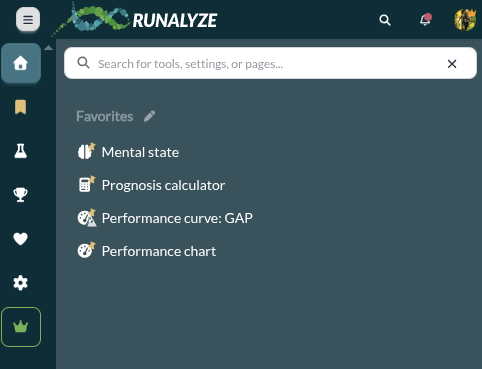
In addition to the dock navigation, the sidebar navigation remains fully accessible on mobile devices.
The sidebar provides access to all sections and features — and now includes a built-in search function to make navigation faster and more efficient.
At the top of the sidebar, you’ll find a search field that allows you to:
- Quickly find tools, settings, or pages
- Jump directly to specific features without navigating through menus
- Access frequently used items via your personalized favorites
This is particularly useful as Runalyze offers a wide range of analysis tools. Instead of browsing through multiple levels, you can simply search and open what you need.
The combination of dock navigation for quick access and searchable sidebar for full control ensures that both simple and advanced workflows remain efficient — even on smaller screens.
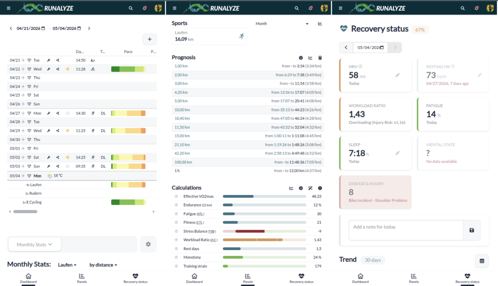
Data Browser: larger by default, flexible when needed
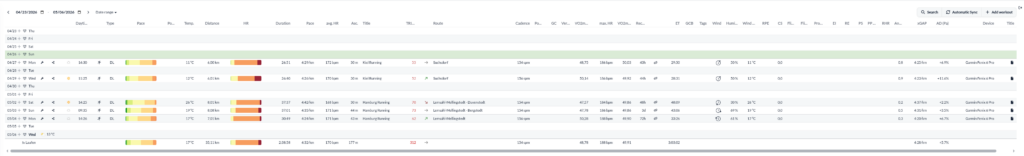
In the previous design, the Data Browser was smaller and more compact.
With the new design, it is now slightly larger by default, improving readability and overall usability — especially for detailed data analysis.
At the same time, a larger layout reduces the number of visible rows, particularly on smaller screens. To balance this, additional controls are available.
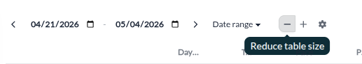
Responsive limits and practical usage
Despite improvements in responsive design, not all tables and graphs can be displayed optimally on every screen size.
The system adapts automatically where possible, but complex data structures require sufficient space. In such cases, using landscape mode can improve usability and visibility.
Back to app development & more Features
With the redesign largely completed, the focus shifts again.
At the beginning of the year, we decided to prioritize finishing the new design before continuing work on the mobile apps.
There are also many features that we can now implement more quickly. Stay tuned to see what else is coming this year