
With the latest update, Runalyze can now display power, pace and heart rate performance graphs for individual activities. These graphs show the best or maximum performance for all possible time periods – from one second to the entire activity duration.
This type of diagram should be familiar to cyclists in particular, who know this diagram as the “Power Duration Curve” – in that case, however, only for power. We go one step further and offer this diagram also for pace and heart rate.
One thing to keep in mind: These diagrams “only” show the performance achieved within a single activity – and not what the athlete could theoretically achieve. In addition, of course, only contiguous sections are taken into account. Therefore, zigzag curves (as in the 2nd example for an interval training) are also absolutely valid.
Example: relatively constant effort
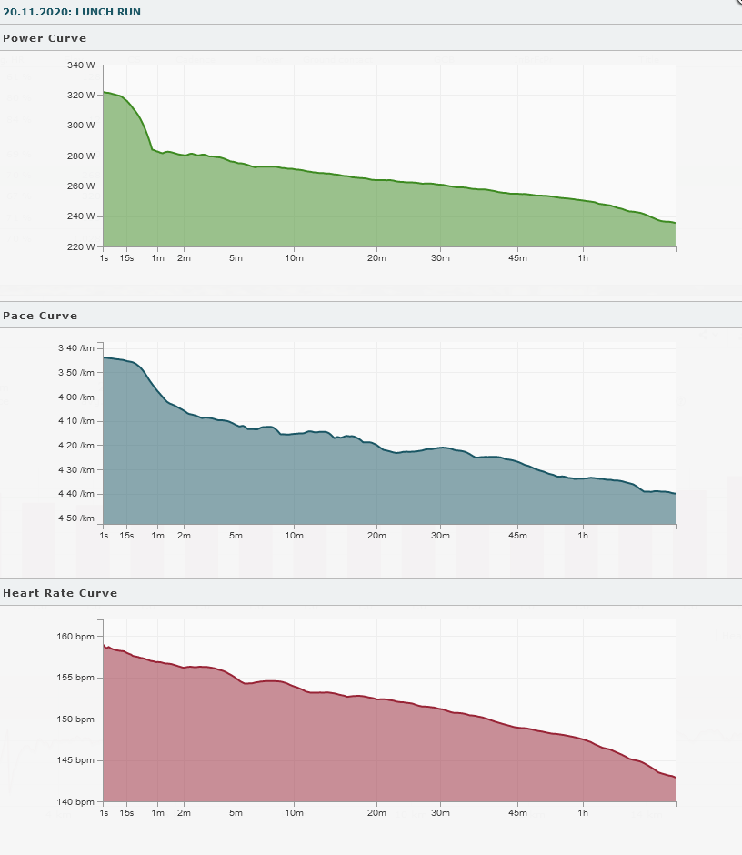
In this case, power and pace each show a clear peak for up to just under a minute before the average performance decreases only slightly over the rest of the course. This is a fairly typical picture for an activity with a relatively constant effort.
The data can be interpreted (in terms of power) as follows:
- A maximum power of about 320 W could be achieved.
- A power of over 300 W could be held for a maximum of approx. 30s.
- A power of over 280 W could be held for a maximum of about 3 minutes.
- The maximum power for any period between 5 minutes (275 W) and one hour (250 W) differs only slightly.
Example: Interval training
A somewhat different picture usually emerges for interval training, where a jagged curve usually emerges. The fact that the best performance for 5 minutes (278 W) is greater than for 3.5 minutes (265 W) is not a contradiction.
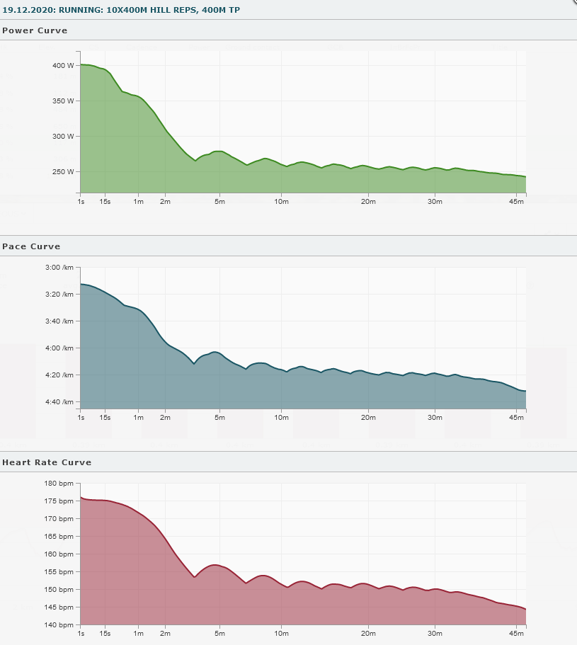
In this example, 400m intervals (uphill) were run with the fast sections in about 1:30 and the slow sections in about 2:00. As a result, the curves drop significantly until about 3:30, since a segment of this duration can contain a maximum of one fast section. Only then is there a renewed increase until about 5:00. This best performance over 5 minutes now includes two fast sections and one slow section (2×1:30 + 1×2:00 = 5:00). Analogously, it goes on and on for longer sections, so that the waveform shown here is created.
This makes the curves very different from a histogram, which would show about 15 minutes of highest load (> 300 W) for those 10 repetitions – and not the information whether this load was done in one piece (tempo endurance running) or in sections (interval training).
Outlook
Of course, we would like to offer more features based on these individual performance curves – especially the view of the performance curves for e.g. the last 90 days or any period (e.g. comparison 2021 vs. 2020). These features are planned and should follow this year if possible. But of course they need a lot of server capacity and will probably only be available for paying users (in the upcoming premium level). In the current preparations for this, for example, we are talking about server processes that are already running for several days.